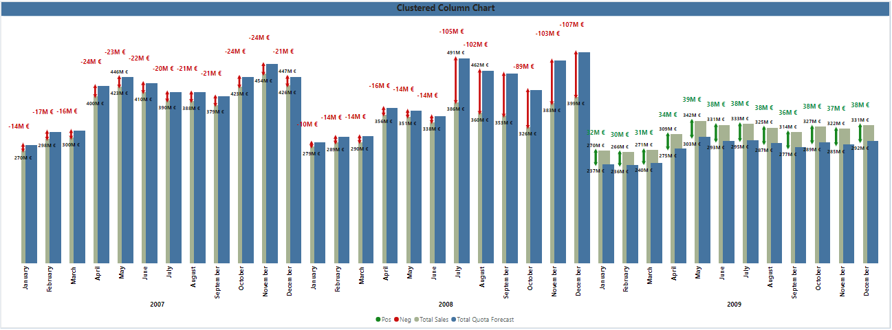
After watching the following tutorial from Injae Park it is clear that the new IBCS standards injection into Power BI visuals (since the Feb 2024 update), including overlapping clustered column chart functionalities, allow us to reflect more data in a condensed manner. The result is better story telling, a quicker insight into delta values and a better visualization experience. The new clustered column charts offer new ways to display multiple data points in a denser chart framework. The picture above is my take on the chart, after getting the knowledge from the tutorial.
Getting the data labels I wanted (more or less) was a bit of a tricky trial and error game. The order of columns, making some columns transparent (pos and neg) and using them to color the error bars accordingly by matching the column color, yet making the column transparent was a very useful idea.
We have 2 data bars, pos and neg, which have the same value – the max of either the actual sales or the forecast, +10% on top to get the data label positioning right.
Then we have the 2 data columns that we want to display, actual and forecast sales values.
The goal is to display the delta on the same chart and use upper and lower bound values for each delta bar. These delta bars are based on the pos and neg columns, which are made transparent. However, it is still possible to add the error bars. The upper bound of both error bars share the same measure – the max between either the actual or forecast sales. The lower bound values differ, depending on whether the delta between actual and forecast is positive or negative. I take the max of either value, depending on whether the lower bound should be from the max of the actual sales, or the forecast sales column.

Using the error labels allows us to get data labels for the range values, indicating the upper and lower bound value for the delta between the actual and forecast sales values.
The bar itself is set to match the color of the pos data column, which as mentioned is made transparent, yet set to green to get the error bar to be green as well.
The pos data column only shows data if the delta between actuals and forecast is positive.
The neg data columns only show data if the delta between actuals and forecast is negative.
Finally, to get more out of the IBCS style in Power BI, we set the canvas size to custom – 1080px x 1920px. This allows us to make the data labels as visible as possible, as there are a lot of columns to be labeled. Therefore, achieving further data density.

Less is more – if we get the data labels to display (using the error bars) – we don’t necessarily need y-axis labels, nor a title for the x-axis is as it is self-explanatory. Perhaps further information to describe the delta values pos and neg in the legend is useful, however I kept it as basic as possible.
Unfortunately, when having multiple columns, and overlapping them, achieving Power BI to display data labels in the center of the bars for instance, or changing the orientation does not work well. Therefore, I stuck to the error bar labels, and the transparent column labels.
To get the final Delta Value label, I added the native data label to the outside end of the transparent columns pos and neg accordingly and added the conditional color measure. You can also add symbols to this value, formatting it as text if needed.
I tried to get the X-axis labels to color conditionally as well, as the option is given, however Power BI does not have a context regarding the chart data and cannot differentiate the values for each month, resulting in everything having a matching color, regardless of the conditions.
Also do note that since the error bars and the data labels are linked to different columns that overlap, they will also have slightly different positions next to each other. Because the transparent columns have slightly different positions.
Therefore, we put the pos and neg columns before the actual and forecast columns.

This was a fun new exercise, and surely the Power BI team will keep developing new ideas to further enhance the visualization and storytelling experience.


