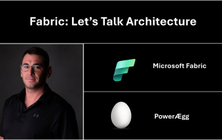
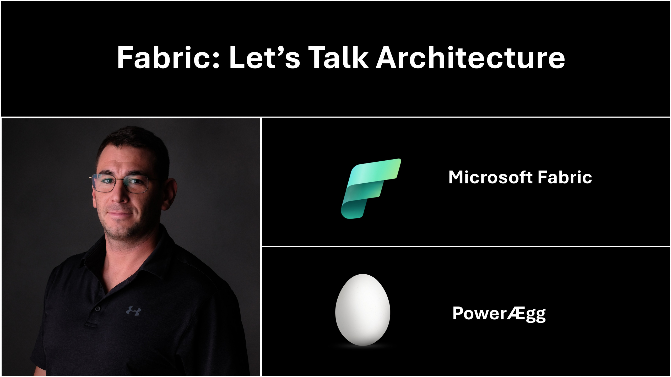
Beyond Static Charts: Building an Interactive Pie Chart That Actually Tells a Story

We’ve all seen them—those lifeless pie charts buried in dashboards, silently displaying data with no context, no story, and no spark. A few weeks ago, I found myself staring at one and thinking, “There has to be a better way.” I didn’t want just another chart; I wanted a visual that helped [...]

By |2025-08-03T13:59:30+01:00August 3rd, 2025|Power BI, vibe coding|0 Comments

Fabric Tutorial – Taming Large Data Models in Power BI

Working with large datasets in Power BI can be challenging, especially during development when importing the full semantic model can slow down performance or even crash your environment. To solve this, I created a method that uses parameterized imports to allow developers to work with only a slice of data—without [...]

By |2025-08-02T12:41:29+01:00August 1st, 2025|Fabric, Power BI, Tutorial|0 Comments

New Native Power BI Clustered Column Functionalities

After watching the following tutorial from Injae Park  it is clear that the new IBCS standards injection into Power BI visuals (since the Feb 2024 update), including overlapping clustered column chart functionalities, allow us to reflect more data in a condensed manner. The result is better story telling, a quicker insight into delta values [...]

By |2025-08-15T20:49:48+01:00February 28th, 2024|Fabric, Power BI, Tutorial|0 Comments
Go to Top